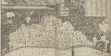
In the 1530s when Henry VIII realised that dissolving the monastries would get him much needed assets, he commissioned a map of London, paying particular attention to ‘lawless’ Southwark. He wanted to see if the borough had any money he could take off them. Henry VIII was a smart man, he knew that the right sorts of information bring wealth and power.
I saw the resulting map last year at the British Library exhibition London: A Life in Maps along with many others – maps of wills and estates, Victorian cab fare maps, cycling maps and tourist maps. Each map was primarily motivated by the need to learn more about an area of London in order to make or save money, especially when making your way around the ever growing London.
In part, this was because travelling around London has always been a daunting thing to do and if you don’t know your way around, you can waste a lot of time and money on convoluted travel. Visualising how everything was connected was impossible to do until Phyllis Pearsall personally pounded the streets, all 3 000 miles of them and put together the world’s first A to Z. She realised that London had to be presented as a cohesive system of streets, buses, and tubes. Like all fantastic ideas, it is so obvious – but back then no one had ever thought of it.
This wasn’t the first time cross referencing different types of data could help people. In 1830’s Dr John Snow used a map of London on which to plot water pumps next to cases of cholera in order to identify how the disease was being spread. He concluded that it was an infected pump near where the outbreak had occurred, and not an airbourne miasma which was the hysterical masses feared. Once he had identified and closed the infected pump, it was easier for Joseph Bazalgette to get the support he needed to build sewage systems which are still used to this day.
Breaking news infographic style
Many online journalists have adopted the same visualisation techniques to present breaking news. They have maps which plot events and eye witness accounts either by video or audio. This information is put up online, as it happens. People get an immediate insight to events good and bad and can make informed make decisions that may save lives.
Techniques range from sophisticated virtual reality programs to simple line graphs. Sometimes this is done well as in the Dr Snow example, other times techniques can be badly employed. Edward Tufte has written extensively about the way to avoid chart junk so that more meaningful graphics can be produced either by hand or as in the case of scientific visualisation by harnessing the power of computers.
In meteorology, molecular modelling, and medicine, computers show us things we could never have seen otherwise: the inside of a bone, or a hairline fracture not detected on an x-ray but visual in a 3D rendered pelvis.
Even football is given a helping hand. Redbee’s Piero software uses live footage from football matches and ties it to a virtual stadium to calculate the exact coordinates of players and the ball during those crucial moments not seen by the referee or caught on camera. Piero creates new virtual camera angles (or viewpoints) and approximates what happened so that the right decisions can be made.
Recognising and reading the patterns
Previously we thought that the field of artificial intelligence would produce systems which could crunch through the numbers alone and present the solution to us. Now we know this is still for the future. We humans are adept at recognising patterns and making links in an almost intuitive manner which is impossible to replicate in a computer. Cognitive scientists try to crack the secrets of the brain and our minds to understand how we reason. Until the time when we can let our machines reason with us, we need to stick with and have control over what we want see.
Football technology is an ideal application for visualisation as there are a limited number of rules to represent and a field of play to be modelled which gives us all of our constraints and the context within which to search. Other applications such as monitoring bridges or the people/traffic flow through a town can be without boundaries so we are left just to literally stare at the waves of data as they happen.
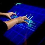
To counter this feeling of being deluged, we need good systems which we as the viewers can interact with and which we, the users, can fix constraints and context. In this space we can then explore and search, using interactions which are translated into algorithms. We exploit and manipulate new viewpoints (like Piero does), we fixate on a viewpoint, we apply analogies and metaphors to find different ways of interpreting what we see and then we transform or combine our data, again to find different viewpoints. The problem is, we sophisticated humans can do this automatically, computers can’t yet, they can only flag up certain patterns that we have told them about.
Maps: Ideal information systems
Exploration is difficult to support, often because the visualisation aspects of software often dominates to such an extent that basic functionality is compromised. Information is presented to the user in a potentially misleading manner and the wrong conclusions are drawn. To counter this, there needs to be a direct correspondence between the human perception of the physical world and the abstract computer-internal representation. Maps are a perfect example of this correspondence and have worked well for centuries. Henry VIII obviously knew how to manage his data.
Google Maps allows you to look at the abstraction of the map and superimpose it on the photographic representation. You can zoom in and look at the trees and houses and still be aware of the street names. This is an accessible form of augmented reality which would have been difficult for the man in the street to imagine on such a widescale i.e., the whole world, even ten years ago. Imagine what Henry VIII would have done with such information at his fingertips, whilst sat in his palaces. He would have zoomed in on Southwark borough and had a magpie’s view of the rich pickings.


16 comments