Recently, I created my first online course in human-computer interaction (HCI) which is now available over on Udemy (check out my course page for the latest coupons). It was a really interesting experience which I am looking forward to repeating, not least of all so that I can incorporate all the things I learnt making the first one, which I am recording here for future reference.
Udemy provides lots of materials to help potential instructors and says that the average course takes three weeks to create. This made me wonder if I was in the right place. I’ve spent longer than that just writing a blog post. However, I was intrigued by the idea of creating lectures consisting of 2-7 minutes maximum. Could I say what I needed to say in such a short space of time?
The main part – recording and editing – took me from March 2020 until August 2020. This is because that by the time I got to July, I realised that I needed a deadline, otherwise I would potentially work on it forever, so I registered and successfully completed the Udemy 45 day challenge.
Technical preparation
I first got curious about online courses in 2017 and did three: TED’s Chris Anderson on How to give a TED talk, Alexa Fischer’s Confidence on Camera, and How to Pitch yourself, all on Udemy. After that, I practiced on YouTube. I filmed on my Google Pixel phone and bought two soft top boxes mainly because my halogen lamp in my office had broken and I needed another light. Turned out the soft top boxes were the best buy ever, as on a dark day they make my space a sunny, happy one.
After some experimentation and following Fischer’s advice, I set up the soft top boxes with the natural light from my window in a classic three point system. I powdered my face so that it wasn’t shiny and sweaty. I experimented with different blouses and backdrops to my talking head. Finally, I decided on the reading nook in my old flat as a backdrop, and wearing a green blouse was best. I made sure my hair and make-up were tidy because when they weren’t I got a bit distracted, like the time after drinking tea between shots so that my lipstick looked like it had been applied by a four year-old, and I had to redo the whole thing.
Interestingly, my husband was like: No one notices what you look like, which is just not true – as a woman of my age, sadly, I was trained from birth to be and look as attractive and as pleasing as possible. Ugh. Film theorist Professor Laura Mulvey says, female bodies in films are positioned as to-be-looked-at, and these bodies are viewed from a masculinised subject position/gaze. Thankfully, things are changing, but it’s too late for me. I feel obliged to look as good as I can whilst being better than my best. Grrr! I’m trying to break out of the pattern, but even this morning I came down to breakfast and said to my eldest, Ooooh your hair looks nice.

Then, I took the recommended Udemy courses: 1) How to create your course. 2) How to set your course goals. 3) How to film your videos. 4) How to improve your video quality. 5) How to edit your videos. 6) How to add practice activities. (I didn’t put in all the links, just go to Udemy, they recommend them one at a time in a practical come-this-way, you-can-do-it fashion.)
After some trial and error, I decided on: my Google Pixel Phone – it really has the best camera, way better than my laptop and digital camera, a panda lapel microphone, Camtasia 2020, and Audacity Wavepad Sound Editor, for filming, sound, and editing.
I also used Microsoft Powerpoint, Gacha Club, and Doodly to illustrate what I was saying because even the talking heads need to have some variation otherwise it can be monotonous. Also, they are useful to put in when I’ve edited out sections of film and the camera action looks choppy. I like Powerpoint as software, especially the latest version, it has lots of interesting templates and capabilities. However, for me it isn’t the best way to deliver information, especially in a lecture. I have loved reading all the various viewpoints in particular, this one: Let’s ban powerpoint in lectures – it makes students more stupid and professors more boring, and of course, Amazon’s blanket ban of Powerpoint in meetings. Employees have to write a six page maximum document to deliver the information they want everyone to know. (I couldn’t decide on a link as there are so many web pages on this topic. I recommend looking it up.)
I tested out recording the audio in the wardrobe, at my desk, under the desk with blankets, in bed under the quilt and a few others I’ve forgotten about.
After some experimentation, I realised that as long as I cleaned up the audio with the Wavepad Sound Editor, it didn’t make a difference where I recorded and it was easiest at my desk. However, I much preferred doing the initial recording in Camtasia, cleaning it up in Wavepad, and then pulling it back into Camtasia for editing.
Each time I cut chunks out of either audio or video, I would save that as a much smaller file, and then load in the new version to keep the end video as small as possible.
I also used the Udemy feedback service to get advice about my sound/lighting set up, delivery and style of my videos.
Designing the course
I had already taught HCI several times. It is a bit of an odd subject as it has no core competencies, so depending on who I am teaching, I change it to make it fit in with the rest of the syllabus. I’ve taught it from a software engineering point of view (POV), a design POV, and a cognitive science POV.
In 2013, I decided that I wanted to teach HCI from a user experience (UX) POV, it is after all, its superset, so I wrote a blog called Web Design and the Science of Communication, which I then turned into a web series in 2015 as I added new thoughts to it when I was teaching web authoring.
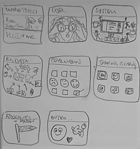
But it was only last September when I decided to finally start my outline after watching all the Udemy videos, I realised that my blog series outline wasn’t quite right. So, I followed the Udemy advice and downloaded their Excel template and got a bit stuck. I don’t enjoy using spreadsheets for planning and writing. I only like using them for numbers. I also got a mad troll online going on at great length about that blogpost. Funny what people get excited about. I deleted their comments which was quite nice and all empowering. Next, I tried a table format in Word which was slightly better, though still not ideal, which is when I started sketching out ideas, like the picture at the top of the blog.
To plan out each section, my goodness, I went back right through my old HCI lectures which was hilarious because even after I took what I needed and put them in the fire, I still wanted to go back and reference them some more. Last winter was fab, I burnt all my old lecture notes and most of my journals and old letters. My eldest kept doing impressions of me in the voice of Mama Coco saying I kept his letters, poems he wrote, adding on the end, until I burnt them. During this time, I looked up all the old references to see if they were still useful or not and then I trawled right back through this blog to find all the new stuff in order to include it.

As I was going through everything, I created a list of 101 of my blogs for reference which I used in the course.
I tinkered with this outline for a good while, adding and deleting sections. The hardest section was what I have eventually called System.
In the HCI literature we have lots of similar, classic rules, which are still used, such as Ben Schneiderman’s eight golden rules of interface design. Jakob Nielsen’s 10 usability heuristics in 1995 and best practices for lots of other stuff like when to use pictures on webpage, Donald Norman‘s cues, affordances, visibility, mapping, constraints, consistency etc., which he presents very nicely in the Design of Everyday things. On top of this there are books I still like students to refer to such as Saul Greenberg’s Paper Prototyping, HCI book of Alan Dix et al, Brenda Laura’s Computers as Theatre, and the beautiful Universal Principles of Design and anything Edward Tufte ever writes. There’s lots more I’ve referenced but they are hard to remember.
For the first time ever I put everything in a big table to cross reference them to see if that would help, but it was overwhelming. After much pondering, I decided to create five groups of all the rules in a big mash-up. I call these the 5Fs which make them easier to teach.
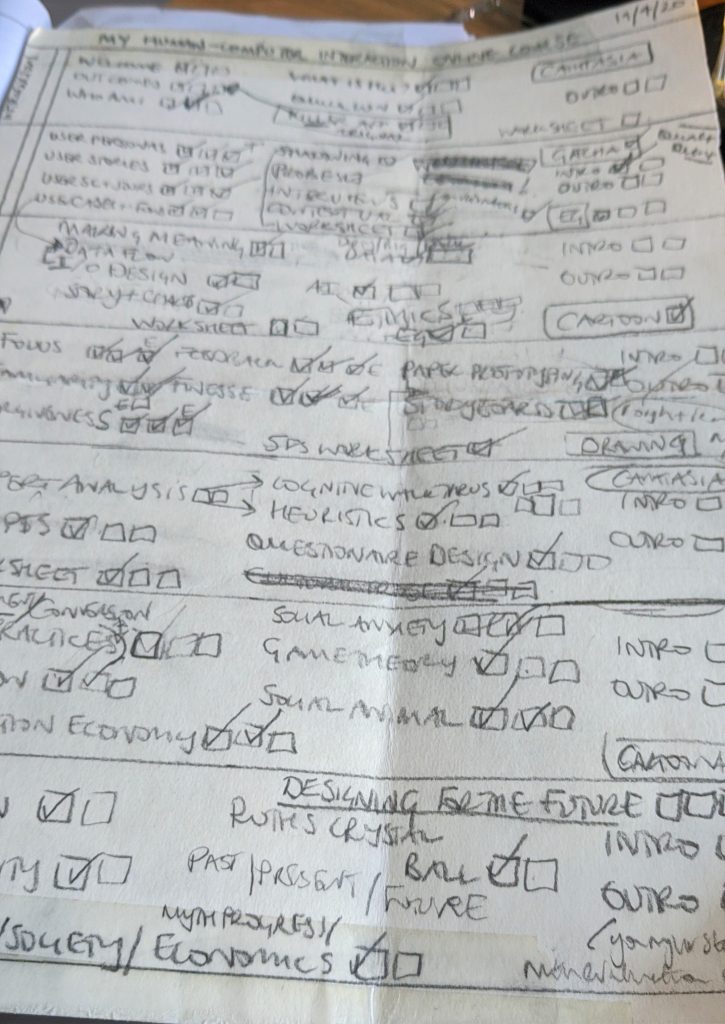
I could have been tinkering with my outline forever, so I started filming as soon as it seemed reasonable. I created a big chart to tick off each section as I completed it, in pencil, but even then I kept regrouping things and kept rubbing things out and adding things in, as the chart below shows.

Recording
I filmed the course a few times as initially I thought I could wing it. Turns out I couldn’t. Giving short recorded lectures online is very different to teaching either online or offline live for an hour, or so. I couldn’t just have some notes and keep it brief. Editing big rambly recordings takes much longer than I thought. In the end I wrote scripts. Even that was challenging, as I wasn’t always100% sure of what I was trying to say to answer the question: What is the key message of each section? I tried to answer this by having three points.
Sometimes when I couldn’t get to the heart of what I was saying I would ramble on and record myself on my phone and then listen to myself and take notes. Other times I would take my old YouTube videos and download the transcripts and edit them down to a manageable amount.
I might have found the whole process easier if I hadn’t written as many blogs about HCI but soon let go of the idea that I had to say everything I’ve ever thought about HCI especially my own original thoughts, though that said there’s a lot of stuff in the course, I’ve just not seen anywhere else yet.
To get an exact idea of the time it takes to speak – something I had never really thought about before, I originally used my Ghosts of AI blog recording and the words, something I created just for fun one afternoon long before I decided on the course, but was glad I had as it turned out be very useful. It is 1550 words long and it takes me 11 minutes 15 seconds to read it out. Therefore, I speak 138 words per minute though I did try to speak slowly in order to be understood. Not that it makes much difference. I had to edit every last word on the auto caption generator as it did not understand a word of my exotic Boro accent.
Here’s an example of me trimming down a script, which I didn’t use at all in the end. It was just much better to make a completely new one for the course. I took the recording I made in October 2019 Social anxiety and emotional resonance (13 minutes and 32 seconds) split out the audio and reduced it down to 2 mins 27 seconds which I then animated in a Gacha guide to social anxiety. Gacha movies are best made on a phone which I then transfer to Camtasia.
I love Gacha movies over on YouTube, my kids got me into them. So, I was originally planning on doing lots of movies and sometimes alternating with Flickpage animations but after a while I realised it was overkill. I would never finish it, and students sometimes need just a plain slide with a definition or some points in order to underline what that section of the course is trying to teach them. Sometimes I didn’t do this and went with the Gacha instead which I think is a bit distracting. And, as much as I love being entertained by cartoon movies on YouTube, I am not a skilled artist, I am a HCI lecturer and I would need to employ an artist to create something like that. I compromised by illustrating certain points just with Gacha stills, using a storyboard approach.
I experimented a bit with music but again it was too much. Students need to hear what the lecturer is saying. I only have music at the beginning and ending of the promo video.
As I was putting the whole thing together, I followed Udemy’s advice to the letter about quick-wins, introductions and outros, pep talks, tangible results, and promo videos. They have collected a lot of data and can tell you to the second what works and what doesn’t.
What would I do differently?
- Script every last lecture to the second. The 300 words guide is a useful one, if I am going over two minutes which I often did, it was because I was making sure that I was saying something that really needed saying.
- I would not use any of my blogs as a script without rewriting them. I did this in the evaluation section and it is full of Ands and Sos, which apart from being not great from a good English grammar point of view was particularly disturbing when it came to editing the captions. My husband always complains about it when he reads my blogs, which I didn’t think was a real problem until I got to listening to myself. I don’t say So I say Sew. Ask anyone from Middlesbrough about smoking and smirking, floating and flirting, we get into loads of sticky situations. If I hadn’t had such an accent it wouldn’t have been as noticeable, as it was I was distracted by them and all the ands and buts, but then to be absolutely fair, no one else is ever going to watch my course as much as I have watched it. And, now (gah, see I do it all the time) I am trying to write better English.
- I would absolutely use Gacha again but script those videos too.
- I would use Doodly again but would have to buy all the extras as there are a limited number of scenes to use.
- I would try using Camtasia inside of Powerpoint this time, instead of the other way round.
- When I do screen captures with Camtasia I would immediately name them something meaningful as sometimes when I reused clips I had to spend a long time looking through every single video to find the one that I wanted to use.
- Same with the Gacha screenshots as sometimes I was trailing through hundreds of them in order to find the exact one I wanted to use.
- I would decide on a naming system for each video in advance, as part way through I changed them and had to reload loads of files.
- I would start my plan this time with doodling pictures and three points for each section – no Word or Excel until I was certain about how I wanted the course to be organised.
- I would put an example at the end of each section instead of leaving a big whopping one at the end of the course which most students are not watching because it’s too long. But, this is because I didn’t understand what Udemy were talking about when they were talking about bonuses.
Okay, I am sure there are lots more things which I will remember as I go and do the next course, which I could add here, or perhaps not as this is over 2K words long, see what I mean? It is very easy to talk forever, much harder to be succinct.
I loved making the course and exploring different ways to teach more succinctly and I just can’t wait to do it all over again. Wish me luck!


One comment