I got a new credit card the other day with my forename Ruth written as Rurg.
I rang the card helpline to get this error rectified, and I could actually hear the man retyping my name as he requested a replacement card even though he already had a screen full of all my details which he had asked me to confirm: name, date of birth, address, etc., as proof that I was actually who I said I was.
This showed me how the error got there in the first place. Why? Oh why were these system users retyping information which was already digital and displayed on a screen in front of them? These users should have been clicking a button to request a replacement card which runs a script that automatically populates a request form screen reusing and thus keeping the integrity of my data.
On top of this, the man then informed me that my name wouldn’t fit on the card. I was like? What are you taking about? RURG and RUTH use the same number of characters. Again, why didn’t it just automatically come up with the same name that is on my bank account?
I write here at great length all about the creative collaboration of computer and human, and I like to spend my time thinking about how we can be augmented by technology. However, we cannot do that until we get our design rules straight.
Anytime your system asks a user for some input, you have to design said system so that there are constraints around how the user can enter this data e.g., if it’s a date, have a drop down box of months and days, if it is their name, ask if the name in the system should be used. Next, the system has to ask the user to confirm and check what they have entered is accurate so that they have a chance to see that the account owner Ruth will not want her forename on her new card written as Rurg and that is a typing error. And, if the information is already there, don’t ask them to re-enter it, reuse it. Constraints, confirmation and feedback are basic things to implement when error handling in system design. Not only do they prevent errors and time and money, they also make the user feel better, feel supported and feel like they are in control.
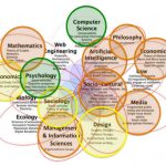
There are many ways to define human-computer interaction (HCI) but the definition I use a lot is this one:
HCI is a discipline concerned with the design, evaluation and implementation of interactive computing systems for human use and with the study of major phenomena surrounding them (ACM, 1992).
We are designing for humans who work in distracting circumstances and who make errors, our job is to support them and as hifalutin’ as I like to get about HCI, it has to start and end with common sense. There are so many examples of how tweaking a graphical-user interface (GUI) here, or removing a log-in screen there, has saved time and human error and in some cases millions of dollars in the working day of many corporations and made the experience of using some software much nicer because of simplifying the data entry.
In the case of my Rurg card the bank has to spend time and money replacing my card because they haven’t sorted out their data entry. On top of the fiscal considerations, it couldn’t have been nice for that man in the call centre to get into it with me over my name because it’s embarrassingly wrong and then for him to have to type that in again, wrong. He is not supported by the system at all, he doesn’t feel in control of it. The usability of that system: easy to learn, easy to use, is not evident. The man had to put me on hold as he didn’t know whether he should have been requesting a replacement card or reissuing a card. It was clear to me, but not to him, because the system was unclear. I dread to think what screens he was looking at.
It seems that it was designed without crossing the gulf of execution, as defined by Donald Norman, which means that what goes on in the computer and what goes on in the user’s head has a gap – or a gulf – between them, and it’s our job to cross that gulf so that the execution of system and user together creates a positive user experience.
At its simplest this is designing a dialogue between computer and human and I might like to say, as I have done in the past, that this dialogue is rather like physicist David Bohm’s interpretation of the word dialogue which involves a mutual quest for understanding and insight to create new information. In this case, the computer could have automated the whole bloody dialog. There was no need to get the human involved. In fact it would have been better. There was no need for any insight, just a straight copy and paste preferably done by the computer.
It seems that we still automate the wrong things and divide the labour incorrectly, because design is driven by people who are making decisions based on a trade-off. We see this time and time again. I have many a time had to design around an old crappy content management system which for historical and political reasons won’t be replaced.
In my card’s case, I can only guess that it is cheaper to have call centre users retype information and introduce errors than to have someone rewrite part of the system which would transfer this data from one screen/system to another. This is not uncommon. Somewhere along the line someone always makes a trade-off: economics over usability, speed over safety, or aesthetics over usability and users are not supported as well as they should be. Online we can look at platforms like Facebook and Twitter and see that they do not look after their users as well as they could (I have blogged about that here) which results in other users being abused. Technology never lets us down, it is people who let other people down.
HCI is so multi-faceted but it has to start and end with our users and looking after them which we often don’t do because of the constraints placed around the design in terms of time and money which causes no end of unseen problems. This is why I am sticking to the above HCI definition, the phenomena which surrounds the design and evaluation of interactive systems never cease to amaze me. Humans are infinitely resourceful and interesting even when the basic rules of system design are not in place and the systems they are dealing with are terrible, as a designer I will always expect the unexpected and then as I see users struggle, I try to feed that back into the design, in the hope of creating a better system. Hope over experience every time that someone down the line will say yes to usability over economics for once. How magic would that be?
Until then let’s stick to the rules and let the computers do the copy and paste.
My course on Human-Computer Interaction is now available over on Udemy.


One comment