A collaborative medium, a place where we all meet and read and write.
Tim Berners-Lee
[Part 5 of 7 : 0) intro, 1) story, 2) pictures, 3) users, 4) content, 5) structure, 6) social media, 7) evaluation]
Many designers have adopted a grid structure to design web pages because a) it lends itself well to responsive design and b) it allows a design which is easy for users to understand. Designers literally have about five seconds before a user will click away to find a different service/page/content provider if the page is laid out in a way which is difficult to understand.
In a great talk for An Event Apart, Designer and Developer Advocate at Mozilla, Jen Simmons looks offline at magazines for inspiration and remembers how there was much experimentation and creativity online until everyone adopted grids and fell into a rut of grids.
But, it is easy to understand why everyone adopted grids, because users create their own understanding of a webpage from its structure. Text is complete within itself and meaning comes from its structure and language rather than the ideas it contains. This is a fundamental principle of semiotics, the study of meaning.
Managing expectations
When a webpage is judged to be useless, it is often because it does not behave in the way the user is expecting, particularly if it is not very attractive.
Designers either need to manage a user’s expectations by giving them what they are expecting in terms of the service they are looking for, or they need to make it super attractive. Attractive things don’t necessarily work better but we humans perceive them as doing so because they light up the brain’s reward centre and make us feel better when we are around them. We are attracted to attractive things which is given by certain Gestalt principles such as unity, symmetry, and the golden ratio.
Gestalt: similarity, proximity
Good design is one thing, but we also have specific expectations about any given webpage. We scan for headings and white space and interpret a page in those terms. This is because according to Gestalt theory we will interpret items according to their proximity: items which are close together, we will group together; or similarity, items which are similar we interpret as together.
And also, because we have been to others sites and we transfer our experiences from one site to another and anticipate where certain functions should be.
Where am I? Where have I been? Where am I going?
Main menus are usually at the top of the page, grouped together and are used for navigation through the site. Secondary navigation may take place in drop down menus, or in left or right hand columns. Specific house keeping information can be found in the footer, or the common links bar if there is one.
If users are completely lost they will use the breadcrumbs, which Google now uses instead of the URL of sites as part of the results their search engine serves up. Therefore, it is in a designer’s interest to put breadcrumbs on the top of page.
Users will stay longer and feel better if they can answer the three questions of navigation as articulated by usability consultant Steve Krug:
- Where am I?
- Where have I been?
- Where am I going?
Often this answered by changing links to visited, not visited and enforcing the consistency of the design by adopting a sensible approach to colour. There is a theory of colour in terms of adding and subtracting colour to create colour either digitally, or on a palette, but there is alas, no theory about how to use colour to influence branding and marketing, as personal preferences are impossible to standardise.
HTML 5 & CSS 3
As discussed earlier in part 1 of this series, we separate out our content from our presentation which is styled using CSS 3. Then, once we know what we want to say we use HTML 5 to structure our text to give it meaning to the reader. This may be a screen reader or it may be a human being.
HTML 5 breaks a page into its header and body, and then the body is broken down further into specific instructions. Headings from <h1> to <h6>, paragraphs, lists, sections and paragraphs, etc., so that we can structure a nice layout. There are thousands of tutorials online which teach HTML 5.
The nice thing about sections is that we can use them to source linked data from elsewhere and fill our pages that way, but still keep a consistent appearance.
Theoretically one page is great, or a couple of pages fine, but once we get into hundreds of pages, we need to think about how we present everything consistently and evenly across a site and still provide users the information for which they came.
Information architecture
Information architecture (IA) is the way to organise the structure of a whole website. It asks: How you categorise and structure information? How do you label it so that users can navigate or search through it in order to find what they need?
The first step is to perform some knowledge elicitation of the business or context and what everyone (owners, customers) known as stakeholders expect from the proposed system. This may include reading all the official documentation a business has (yawn!).
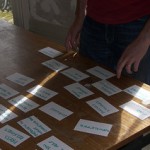
If there is a lot of existing information the best way to organise it is to perform a card sort. A card sort is when a consultant calls in some users, gives them a stack of index cards with content subjects written on them, along with a list of headings from the client’s site—“Business and News,” “Lifestyle,” “Society and Culture”— then users decide where to put “How to floss your teeth”.
This can take a few days each time and a few goes, until a pattern is found, us humans love to impose order on chaos, we love to find a pattern to shape and understand our world.
Once we have a structure from the card sort, it becomes easier to start designing the structure across the site and we begin with the site map.
The site map reflects the hierarchy of a system (even though Tim Berners-Lee was quite emphatic that the web should not have a hierarchical structure).
Then, once a site map is in place, each page layout can be addressed and the way users will navigate. Thus, we get main menus (global navigation), local navigation, content types to put in sections and paragraphs, etc., along with the functional elements needs to interact with users.
Other tools created at this time to facilitate the structure are wireframes, or annotated page layouts, because if is is a big site lots of people may be working on it and clear tools for communication are needed so that the site structure remains consistent.
Mock up screen shots and paper prototypes may be created and sometimes in the case of talented visual designers, storyboards are created. Storyboards are sketches showing how a user could interact with a system, sometimes they take a task-base approach, so that users could complete a common task.
Depending on the size of a project, information architects will work with content strategists who will have asked all the questions in the last section (part 4) on content and/or usability consultants who will have spoken to lots of users (part 3) to get an understanding of their experiences, above and beyond their understanding of the labelling of information in order to answer questions such as:
- Does the website have great usability which is measured by being: effective and efficient; easy to learn and remember; useful and safe?
- How do we guide users to our key themes, messages, and recommended topics?
- Is the content working hard enough for our users?
Sometimes, it may just be one person who does all of these roles and is responsible for answering all of these questions.
It takes time to create great structure, often it takes several iterations of these these steps, until it is time to go on to the next stage (part 6) to start sharing this beautiful content on social media.
[Part 6]


7 comments