A collaborative medium, a place where we all meet and read and write.
Tim Berners-Lee
[Part 4 of 7 : 0) intro, 1) story, 2) pictures, 3) users, 4) content, 5) structure, 6) social media, 7) evaluation]
A website should be looked after and tended. It is not enough to create a great layout and visuals, you need to look after the content and have a strategy for keeping your website in great shape.
Content Curation
The terms curation and curating content are bandied about a lot. I like them because it emphasises that you have to take care of your website or app content, like a curator in a museum would.
In any exhibition, every artefact is linked and relates to the others so that a story is told as you work your way through the exhibition. The curator has spent a lot of time and effort creating an experience. And, so it is with the content strategist. Every piece of information on your website has to be relevant to your brand, message, themes, and communication plan, which all link back to the overall reason your website exists: What is your website for?
In her book Content Strategy, Erin Kissane advises using detailed written recommendations, a content style guide and templates, for each page and wireframe within an information architecture. This is so the people involved in generating or curating the content can do so in a way which produces:
- A site wide consistent tone of voice.
- A clear strategy for cross linking content site wide.
- Integrated content.
- Skillfully used social and community input.
- Accessible and usable multi-media content.
Years ago when I was in charge of my first website (‘Hello World!’), I asked someone if they would write a page or two for new arrivals to our lab. The resulting information was good and useful, but I rewrote some of it to keep the tone of the site consistent.
The person who had produced the original information, was so offended, she didn’t speak to me for a while, and there was bad feeling all round. Now I see that I was just curating my site. Had I been wiser and more experienced I could have offered some guidelines in the way newspapers and magazines have an in-house style guide. Little did I know.
Wikipedia, has got to be the largest example of great content co-creation. Anyone in the world can contribute but the end result is one of a specific style and layout. A user can land on any page and feel that it is consistent and written in a similar way. There are several pages of instructions to ensure this look and feel, so that Wikipedia doesn’t ever feel like a hodge-podge.
Interestingly enough, if you land on page when the content guide has not been followed, say for example that the page is missing secondary links, then a banner at the top of the page will flag this deficiency up. This immediately allows the user to make a decision as to whether or not to use that information, and this leads the user to feel that the page is a work-in-progress. Overall it is does not impact on the reputation of Wikipedia. The user still trusts Wikipedia.
Responsive Content
Looking at content and studying each word, is for those wordsmiths who love words. It requires good editorial attention. Therefore, it is worth hiring someone who can work from the beginning with information architects and stakeholders to work out taxonomies and structure so that the content guidelines and recommendations fit together beautifully.
Karen McGrane states quite clearly on A List Apart, that responsive design won’t fix your content. She has seen many a project fall apart at the end when people create beautiful fast responsive websites which serve up the same old content. No one has evaluated and redesigned the content and thought about how it will look on various devices.
Indeed usability guru, Jakob Nielson, feels the same way and in his mobile design course advises the designer to cut features and content, so that information and word which are not core to the mobile use case can be cut and all that secondary information can be deferred. If the user wants an in depth conversation, they know that they can go to the desktop version for all the extras.
Best Practices for Meaningful Content
Usability.gov provides a content strategy best practices list that you can use to question each piece of content. Does it:
- Reflect your organisation’s goals and user’s needs and overall business message?
- Use the same words as your users?
- Stay on message, up-to-date and and factual?
- Allow everyone to access it?
- Following style guides?
- Allow itself to be easily found internally and externally?
Persuading the user
Ultimately, with content, what we are trying to do is to persuade the user to buy our product, or take some action, like donate money. We can’t afford to bore our users and waffle on. We carefully craft our conversation and entertain them.
Colleen Jones in her book Clout: The Art and Science of Influential Web Content says that this has always been done with rhetoric, which is now a bit of a lost art which we need to regain. For, ultimately, rhetoric is the study of human communication.
We are communicating our message, our story, and we so we need to make sure, as Kissane says, that we: Define a clear, specific purpose for each piece of content.
We need to get to the core of our message.
No Lorum Ipsum
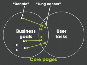
In a great article on AListApart.com, Ida Aalen talks about getting to know what the core information is of a site and then designing around that. She uses the example below, taken from the Norwegian Cancer Society’s lung cancer webpage to demonstrate that there is a lot less needed on a page than stakeholders think. She calls this designing around the core, and if you design around core content and message rather than all the bits and pieces everyone feels should be mentioned on the homepage or elsewhere, then the design itself is very easy to do.
With the content in place, no one is designing pages full of the Lorum Ipsum or Hello World text and decisions are made as to where and when each piece of information is put and links to the next.
Aalen has found that designing this way has led to increased user (or audience) engagement and increased revenue generation. This is because the audience can do things more easily and quickly. There is no extraneous content distracting them from their goals and the business goals, and content becomes a business asset.
Content Marketing Strategy
Once you have all your sharp content, it becomes easier to create a content marketing strategy, which is a different process to your content strategy. This was one is solely concerned with encouraging your audience to engage. Social media is a wonderful tool, but no one really knows how it works, which is why you need a good marketing plan.
Well crafted content is too good not to be shared. But first it needs to be structured.
[Part 5]


8 comments