Another Apple marketing frenzy has led to the UK bracing itself for the launch of the iPhone tomorrow. The Carphone Warehouse is expecting large queues and Scotland Yard are warning customers to hide their new handsets so that they don’t get mugged.
Aside from the excitement there are criticisms. The main ones centre on the iPhone’s choice of network: O2. O2’s coverage isn’t great, apparently even in the Apple store on Regent Street. And unlocked iPhones that early adopters are already using, thanks to Ebay, won’t be able to download new software without damaging them. Vendor lock-in experts Apple are as bad as Microsoft with their need to dictate to customers how their products should be used, which ultimately is a big problem when you talk about the iPhone’s user experience and usability.
Multi-touch interfaces
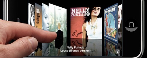
And user experience is what most reviewers, thus far, focus on. The multi-touch interface of the iPhone is offering something new on a mobile phone. Multi-touch and direct manipulation research has been undertaken in the human-computer interaction (HCI) community for over 20 years, even if Steve Jobs is telling everyone that multi-touch is new. New interaction or not, if the rest of your technology isn’t delivering – and all over the web there are disappointed users grumbling about EDGE, streaming difficulties, speed issues, capped page number downloads, and pricing – then a good interface alone isn’t going to save your user experience. It is rather like raving about the interface on an ATM that doesn’t deliver the money you want.
Increased functionality = more complex interaction
It is a shame for Apple that the multi-touch interface is not adequately supported as it is a good interface solution. When you have a device with many functions – phone, camera, web and email, mp3 player, etc., – you potentially increase the complexity of interacting with it. One way to deal with many functions is to include multimodal interaction which offers several ways of interacting with a system such as keyboard, mouse, light pen, voice recognition and others. It can cover a larger target audience because those users who have difficulties with a mouse may find a light pen or voice recognition easier to use. The downside is that more devices or peripherals lead to more things to carry around. The multi-touch enables you to provide one way of interacting and in the case of the iPhone, on a small screen. The disadvantages are that you need to learn how to gesture properly and flex those fingers.
Gestures
Gestures have been used by humans since we first starting communicating and they have long been of interest to the computer community. Facial gestures are researched in virtual reality systems. Hand gestures are common in games and animation. So it is worrying that Apple have seen the need to patent a multi-touch gesture dictionary in the US. I only hope that they are giving veteran multi-touch researcher Bill Buxton a cut of the revenues this dictionary will generate.
These Apple gestures include flick and drag – for browsing photographs and emails, squeeze and stretch – for zooming in and out when looking at photographs. They are great and snazzy but not without drawbacks. Depending on your finger size a flick can be interpreted by the iPhone as a tap, which is used to stop scrolling. And it remains to be seen how satisfying gestures are once you are navigating a large library of photographs and emails. Like most input devices, your finger can be great for many applications and rubbish for others.
Phone fingers needed
Typing out emails on a small virtual keyboard where the letters pop up as you press them may be exciting at first but will it go the way of many typing experiences? The ‘it would be quicker just to phone the person up’. Who can tell? User experience is subjective and difficult to measure. One interface aspect may drive some users mad whilst others love it. So when you rush out tomorrow night to buy your iPhone complete with finger condom to stop the smudges and a Scotland Yard coat with big pockets, don’t expect the ultimate user experience that the marketing hype is promising you, just enjoy owning a new flashy toy. All technology is still a work in progress and even intuitive interfaces have a learning curve.


One comment