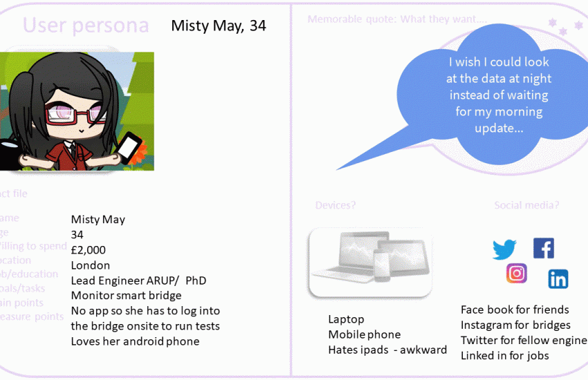
By the end of the getting to know our user stage it is normal to feel swamped with information. The user persona is one tool in our kit that we can use to summarise who our user is and why we are designing for them.
The user persona represents a certain type of user and is the average of that group of user.
The persona has a made-up name, a stock photograph, and then depending on what we are creating we may want to know: age, job, hobby, the devices they use, the location of where they use them – home/work/cafe, the social media platforms they use, websites they visit, and so on.
Finally, we have a memorable quote, or soundbite, which they have said, or something they would say, which sums them up, and it also reminds us of the language they use, which is important when we design.
We organise the information as a fact file, say on one side of an A4 sheet and we put it up on display, so that we remember that we are designing for people. Empathy is a key factor in designing systems.
It might seem unlikely that we could find similarities to create an average user but, there are always patterns.
[ My course on human-computer interaction is now available on Udemy with a #backtoschool $9.99 coupon (expires 22nd September 2020) : https://www.udemy.com/course/human-computer-interactions/?couponCode=5162D4D8C61BB85D3508 ]


One comment