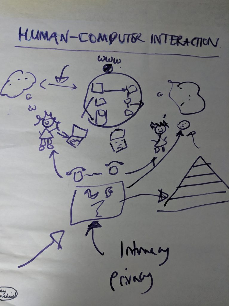
[ 1) Introduction, 2) Dialogue or Conversation, 3) User or Used, 4) Codependency or Collaboration, 5) Productive or Experiential, 6) Conclusions]
[update 20/8/20: My guide to human-computer interaction is now available over on Udemy.]
Recently, I met up with an old friend and as we reminisced about our university days, she wondered if I still went about asking people really nosy questions. Now, I don’t exactly remember asking people really nosy questions, but I do like things to make sense and in my experience, people like to fill in the gaps in their stories and show me things because they know that I am listening, they know I care.
That said, back in April, I was in Naples where a man came out of his booth to ask me to stop staring at his funicular. I told him that he shouldn’t have it out in public if he didn’t want me staring at it. I remain very pleased to have managed that in Italian, though I still can’t understand why he was so upset about my admiration.
Italian funicular employees aside, I still believe as I have said here many many times before, we all want to be seen, we all want to be heard, we all want to matter. We make sense of ourselves, of others, and the world around us with stories. And, we do this even if we are not trying to write software, we are doing it to tidy up ourselves and our minds.
The thing is though, I thought I went into computing to get away from humans but really all I have done in my job is gravitate towards people to ask them about their life experiences to figure out how technology could make their lives easier, faster, better.
So, I was taken by HCI Professor Brenda Laurel’s division of what software does for us. In her book Computers as Theatre, she said that there are two types of HCI :
- Experiential computing for fun and games.
- Productive computing which is measured by outcome or seriousness with implications like writing a book and transmitting knowledge.
This chimes with anthropologist Lionel Tiger’s descriptions of designing for pleasure (experiential) or designing for achievement (productive).
But, don’t we do both? If something is designed well and is pleasurable to use, doesn’t it increase our productivity? Isn’t that what Apple has been super successful at doing with aesthetics, discoverability, and user experience? And, isn’t that the point of gamification? To make not fun things fun.
I’ve always wanted to help humans harness the power of computers, to help make their lives easier by automating the grunt work to free up more time to be creative in. I know that creativity is our life force. It keeps us expanding. It keeps us young. And like, J C Licklider, I believe that the best collaboration of computing and humans is a creative one of collaboration not codependency.
I have blogged about eliciting knowledge for web design as a way to get all the information a designer might need. And, my favourite part has always been shadowing people at work. I have done this round building sites, on bridges, chemical factories, exhibition centres, architects offices and half-built apartments, steel rolling mills, print factories, and people using mobile phones . I love to see what happens a day in the life of people doing jobs I will never have the opportunity to do. I am fascinated by people.
Ever since the first time I was in charge of changing some software, which involved users needing more fields in a database, I have loved helping people with their tech. However, simple this job was, it was my first insight into seeing how the database was there to be manipulated by the user to give new insight into the information they had. Nowadays we tell stories with databases. But, the database must always serve the user not the other way round. I think we forget this sometimes.
When I worked in the field of artificial intelligence, I purposely put errors into various parts of a knowledge based system. The idea being that the test cases I wrote to find my errors should uncover other similar errors which were there inadvertently. It needed extensive training for a user to understand what the system was calculating so that code was precious and had to be error free. And, if it needed to be changed because things are always changing in the real world, it needed a computer scientist to add more code. This I didn’t like so much. This was not empowering. Here the user and computer scientist served the code, not the other way round.
Also, it was difficult to model and represent things which experts knew inherently. So, in the case of the exhibition planning, the software I worked on used a constraint solver which could easily allocate the correct sized booths with required utilities such as electricity and water, but it couldn’t easily model or reason with exhibitor A wanting to be by the door, or not near exhibitor B, without a human. This is a common problem also for dinner planning for fundraisers, so I am told. The software has to be told the nuances of human life, but you don’t want to hard code it, as it is forever changing, which is why you either need a human, or you need a super good graphical user interface otherwise it is quicker by hand.
For a while I thought 3D applications and visualisation were the way forward especially in bridges. Bridges are enormous, last a long time, and information gets lost and the data needed to understand them is extensive, so why not visualise it. I got very excited about augmented reality, to overlay a bridge with plans, original ones, proposed changes plans. It was much harder to do back then as you needed to measure and calibrate the exact camera angle with the AR software in order by hand to overlay the original view (i.e. the bridge) with all the extra information (plans, proposed changes, future behaviour). I remember being out on a bridge for ages fiddling away. However, these days it would be much easier if you use an app you have written on the phone and it’s native camera.
But still inputting new information is not easy, especially on a mobile phone in 3D. I was playing games this morning on my mobile phone and I had trouble putting pizzas in boxes using 3D direct hand manipulation. More functionality equates to more complexity and constantly changing instructions which can be clever but requiring a learning curve as it not always intuitive, but if you are having fun, like I was, then I didn’t mind the learning curve, if it’s not fun, then we all need to be aiming for simplexity.
Experience impacts productivity and why wouldn’t it? Websites and apps are are a bit like designing a self-service instrument. As a user you figure out what is going on yourself. The better and easier it is to figure it out, the more likely you come back and the more you enjoy yourself. If not you will go elsewhere, where someone is listening, who wants to hear your story, to make you feel that you count and that your experiences matter. As Danielle La Porte said:
Design is love.
And what is love if it is not the best experience? Experiential HCI makes everything better. Let’s share the love!
[Part 6]


7 comments