Like all self-respecting computer scientists when asked to think about branding, I immediately googled branding and brand management and up came a list of web pages full of: how-to’s the 3Ps, 4Cs, 6Ws, 10 top rules etc., of designing a brand with the goal of making a product/service/etc stand out in a crowded market. These rules were demonstrated using case studies of big brands such as Apple, Coca-Cola, Nescafe, and Manchester United Football Club (MUFC) and most of then begin with ‘rule’ no.1: Design an eye catching logo.
I pondered this for a while, to see if it rang true, until I realised that I can’t really remember what any of these popular brand logos look like to begin with, even though I have heard of them.
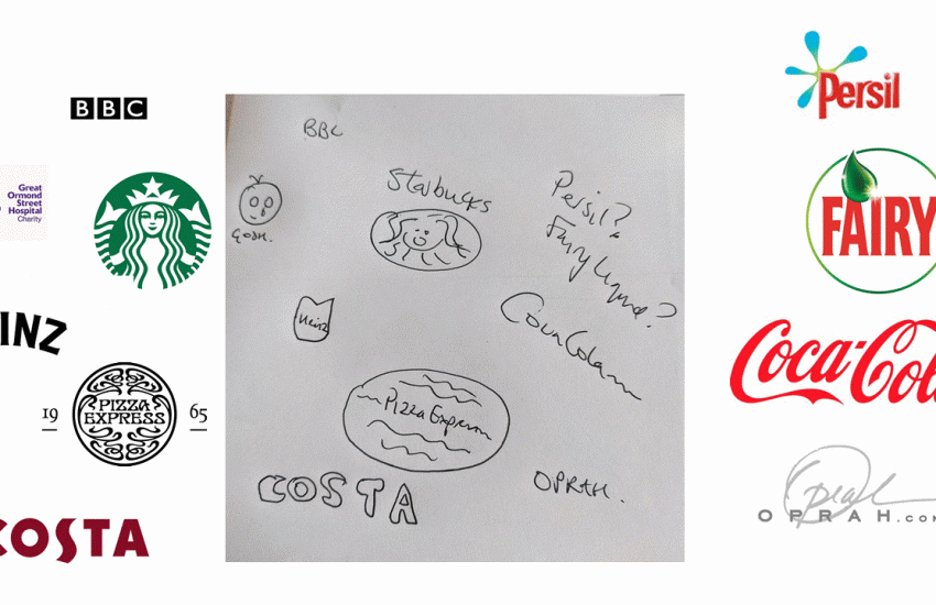
I tried drawing some logos from memory and I didn’t do too well, as you can see from the picture above, I have no idea what Persil looks like, or Fairy, or even Heinz, even though I use them everyday (though my youngest is worried about the environment so we are phasing them out for eco-friendly, plastic-free alternatives). I recognise these products in the supermarket, but off the top of my head, I cannot reproduce their logos and tell you everything they stand for.
Manchester United Football Club (MUFC) is often the go-to case study in brand management but as famous as they are, I had no idea they had a red devil on their logo and that they are called The Red Devils even though the football is always on in our house. The only football club logo I can draw by heart is Middlesbrough FC because my old school uniform had a red jumper with a similar shield and lion on it because Middlesbrough is my hometown.
The reason why MUFC is such a popular case study is because, traditionally, a football team is a local brand, made up of a finite number of diehard repeat customers from their town, not the 659 million fans worldwide the BBC reported that Manchester United Football Club had in 2013, which according to the Mirror in 2019 has grown to 1.1 billion fans, or so the story goes, and let’s face it, we all love a good story – stories matter. MUFC’s approach, apparently, is think local, act global – a slogan originally adopted from health care management during the 1970s to 90s era, when global interconnectivity and real-time communications became more widespread and changed our perception of what was possible and what story we could tell ourselves: A local football team could be global!
MUFC floated on the London Stock Market in 1991 and on the New York Stock Exchange in 2012 and have engaged in amazing business diversification with TV deals, catering, food and hospitality, including opening a chain of restaurants across Asia, doing world tours with their football superstars, as well as the more usual selling football strips and gaining sponsorships from companies like Chevrolet. On top of this, they make alliances with teams such as the New York Yankees and have endorsed various products in partnerships Nike, Adidas, and Jaguar. These huge companies know that a MUFC endorsement adds value with the halo or superstar effect, which is why celebrities are often called upon to sell products like David Beckham and Justin Bieber wearing Calvin Klein. We trust our superstars and we trust the things they advertise. We only have to look at the way that over the summer the return of Cristiano Ronaldo caused MUFC share prices to rise by 10%.
Transferring over to social media was easy, as the MUFC global sponsorship sales director describes fans on social media as addressable individuals with whom the club can have more intimate relationships [because with every interaction] we build up knowledge about who that fan is and what type of content they like to consume. I guess by now they have collected so much data they must know exactly what the fans want in terms of buying branded products endorsed by the club.
Brand is the promise, the big idea, and the expectations that reside in each customer’s mind about a product, service or company. People fall in love with brands, trust them, develop strong loyalties to them, buy them, and believe in their superiority. The brand is shorthand. It stands for something.
Alina Wheeler, Designing Brand Identity, (2006)
MUFC have done exactly this. However, I am not sure that back in the day, MUFC set out to create a brand, although they were originally called the Heathens as they were from ‘The Heath’ but Manager Matt Busby preferred Salford’s Rugby team’s nickname of ‘the Red Devils’ and basically, nicked it as he thought it sounded better.
In a blog a while back I talked about the myth of progress and how businesses rewrite their stories to focus on their triumphs and edit out their failures in order to persuade everyone that their product or technology makes things better. Looking across MUFC’s history, it is easy to create some rules to explain their success. It is what us humans do best, we make up stories to try to make sense of the world around us, and again this has transferred online as it is what experts do to explain how social media works. although the truth is, no one really knows.
Back in the ’90s and ’00s when people were first designing cooperate websites, the ‘rule’ was always to use blue because it is cooperate and business-like. However, the main reason that Facebook’s logo is blue is because, Mark Zuckerberg, so the story goes, has deuteranopia which is a form of colour blindness and blue is a colour he can easily distinguish. It wasn’t designed to persuade someone to use Facebook, that came later, and persuading people not to use Facebook and to use Google+ instead is what made Google+ fail.
Advertising is persuasion and it doesn’t take much to keep someone as a customer unless the product is terrible, because we are overloaded with decisions to make, everyday. We like things to be familiar, and a service or product behaves the same way each time, we will become loyal and trust them, as we have a hankering for consistency. This phenomena applies to everything from US presidential candidates to toothpaste which is why presidential campaigns cost such a lot of money, like the time Donald Trump spent $95 million on Facebook advertising, and some say won the election that way. And, it is why we get upset when our favourite social media logos change, which they do – a lot more than we would think.
In the same way, we will buy the things we recognise – they stand out in the supermarket, because they are familiar to us, or because we have used them before and we do not like change. Not because we have done any research to make a sound decision that they are the best, or that they have the most creative logo. We don’t buy on best design, we buy because of repetition.
The other day I went to the shop to buy some PG Tips and they had run out, and I was there ages trying to pick another brand, eventually, I settled on Twinings, even though Stephen Fry gets on my nerves in the adverts, and lo and behold, I found that I prefer Twinings to PG Tips. I would not have made that change myself because I had no reason to, even if someone amazing was advertising Twinings.
And, this is why using technology is so powerful as it can prompt, cajole and work on me in a way adverts and campaigns cannot.
B.J. Fogg wrote Persuasive technology back in 2003 to describe the way in which the design of a website or piece of software influences users, and this, remember, was back before, social media. Indeed, the book itself did influence the design of many products as one of Fogg’s students co-founded Instagram.
The main points of the book echo two of Brenda Laurel’s in her classic textbook: Computers as Theatre which was first published in 1992: Computers are productive or experiential, so they make it easier for people to be productive and get things done such as writing a book, banking transactions, filing tax returns and so on. Or, they provide an experience, playing a game, watching TV, learning something in a simulated environment, etc.,
To these points, Fogg adds a third: Computers help humans create relationships, either with other people or with software because we view computers in the same way that we do our colleagues and friends. We weigh a program’s trustworthiness and how helpful it is to us in the same way that we would a human being. Once we have made our decision we are more amenable to returning the favour of being helped by a website, by say, completing a survey/questionnaire when prompted on that website, in the same way, we would help someone who helps us. Loyalty is created by technology in the same way as it is by people.
Adding this persuasion to our now pervasive computing, that technology is everywhere now, in ways that we couldn’t have dreamed up back when Mark Weiser first coined the phrase ubiquitious computing and this becomes a heady combination. Especially on our phones, those constant companions we have with us, in ways which can be collaborative or codependent.
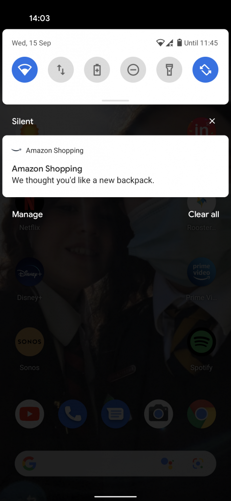
The other day, I was looking online at backpacks as I need a new one, and ended up on Amazon. Yesterday afternoon, Amazon came back to me:

With Amazon I can take it or leave it, but imagine I had an app that felt trustworthy, a health app, or an app in some other area of my life in which I didn’t know what to think and I had not found myself in before, an area in which I feel vulnerable. Now imagine, that I had this app popping up with suggestions – often formed from collecting data about my shopping habits, like Facebook does with it’s web beacons – imagine how computers are tireless and persistent and persuasive and how easy it would be to just do what an app recommends and make a purchase hoping to fix a problem.
I had noticed that Fitbit was doing this more and more which is why I took it off my wrist.
Oprah Winfrey is an amazing personal brand case study, who has, or had, a tagline: You are not alone. Words we all need at times in our lives as we all want to be seen and heard, we all want to feel like we matter. Her constantly changing output has long been a comfort to me, even though I can’t remember her logo, at all in part because it has has changed over time as her brand has diversified to offer more services and products. In contrast, Twitter is one of the few companies whose service/product hasn’t changed at all which is probably why it hasn’t made as much money as the other social media companies and it sometimes messes with it’s logo, but in an uncertain way, as if it not sure, but I digress, sooo, back to Oprah.
Her tagline was originally created to reflect the connection between people, not the one between an individual and her phone, and as Oprah has always been ahead of the curve, it seems to me that her tagline anticipated this brave new world we live in where brands go hand in hand with technology. Logo design won’t ever be the major factor marketers believe they are just the reminder of the brand we love to buy #irl, but on our phones, logos could even disappear, because it is our data, our online digital identity which matters and which through pervasion and persuasion is being shaped by invisible hands who know that we have a need to conform and an even greater need to manage our uncertainty. It is so easy for us to become persuaded, invaded and dictated to by a technology that never sleeps.
Oprah is rarely wrong, so you’d better believe her when she tells you: You are not alone.
You really aren’t!


One comment